
Athletium
 I decided to make a training diary software again. I took the experience from making TrainersLab back in 2003, and tried to improve on all different areas, and also make it primarily for phones instead of computers.
Technology has developed a lot since then, but the general design principles from that time still holds true. After 14 months of work, the result became Athletium.
Feel free to try it here: athletium.app.
Video tutorial: All about Athletium.
This has become a very crowded space; there are a lot of training, fitness, diet and health apps out there. I did some research and found that most of the apps are either not very high quality or don't cater to highly motivated people. I didn't find an app I myself would want to use. So I decided it was time to try and make something different.
I picked the name Athletium because it sounds like a basic element, like titanium, to give it a science flavor. It also makes me think of athletes in a stadium. The logo is meant to look like a stylized square in the periodic table of elements. I wanted some symbol that was universal and not directly related to training, to avoid design clichés. I came up with the Æ ligature, because it contains some of the major letters of the name, and it is a phonetic symbol for the initial sound in Athletium.
Overall design
Most apps guide the user and tells him what to do. I can see the advantage of that, because this how most people go through life in general. The user just enters his personal data, tells the app what his goals are, and the app produces a program that he can follow. The user doesn't have to figure anything out himself, and the app nags him when he forgets to do a workout.
 This guided style has limitations that feel stifling to me, because you need to follow the path the app suggests for you. I wanted to create the opposite of that: An app that is more of a very capable tool that doesn't limit you in any way. I wanted to create the Photoshop of training apps; a steeper initial learning curve, but with very powerful functions that are useful and productive. This caters to highly motivated people, who take charge of their own training and don't want someone to tell them what to do.
Most training apps are sold on their content, and claim to have the optimal training program for every user. Although I spent a lot of time creating my app content, this content is secondary in Athletium, and mostly serves as an example of what you can do with the app. The main value is the tools. Athletium is designed to be a platform that creative industrious people can use to create content for themselves and others. The app's sharing functions makes this very easy.
The original premise of TrainersLab still holds true: "Become your own personal trainer! What is optimal training and nutrition varies a lot between people. There is no "one size fits all" system for reaching your training goals. Instead you should study and get inspired by how others do it, try the methods that appeal to you, and then analyze your results and refine your program."
The design goals were:
- Easy and quick to log your training results
- Open ended in how you create and log training programs and workouts
- Functions that analyze how you are doing, so you can figure out how to reach your goals
- A graphic design that stands out from the current design paradigm, so the app gets an identity of its own
Technology
My initial plan was to make it as an Android app, but I took a chance with going the PWA route instead. Primarily because I have the HTML/CSS/JS skills and I don't want to rely on the Google Play infrastructure. PWAs are apps that run in web browsers, and if you choose to install a PWA, it looks just like a native app. So you can create the app once, and then it can run on both Android, iPhone and desktop computers.
 Next choice was between JavaScript and Typescript. The use of minified code is a must, to speed up loading time and to not give away the IP of the entire code base too easily.
I would have favored TS, but the double compile step (TS -> JS -> minified code) felt impractical and didn't work well with debugging. So I went with JSDoc annotated JS instead, and the Closure Compiler for minification.
It was difficult to decide what software stack to use (GUI components, network, serialization, etc), so I ended up coding it all from scratch. I had some bad experiences in the past spending endless time breaking out of the limitations and bugs of the APIs. So I felt it was worthwhile to invest time in making my own stack.
The app has a strong focus on offline. It is important that the app works without an internet connection, because connection problems is the last thing you want to deal with when you are working out. But offline comes with some technical problems with data storage. There are two options, but both have serious disadvantages: A) Store the data in IndexedDB, which is a more advanced version of the browser cache. The obvious problem is that many users have a habit of clearing out the browser data from time to time. B) Store the data in the file system. There are new APIs for this, but unfortunately they will constantly annoy the user with permission dialogs, which is a very poor user experience.
I decided on using IndexedDB, and handle the data clearing problem by having the app sync with a cloud server to make frequent backups. I coded the server parts in ASP.NET and MSSQL.
Eventually the app became 47,300 lines of JS code, (504 KB minified), which is a fairly large one man project.
Graphic design
Most apps today have the flat minimalism interface style found in Windows 10. This style make interfaces look ambiguous and hard to understand. It also looks boring and lifeless. I wanted my app to be the opposite of that, in part because I personally dislike it, and in part to stand out from the crowd. I took a bold chance of using strong colors, a textured background, and shaded GUI elements that give a 3D feel.
The interface is portrait mode only, because it is designed primarily for phones and tablets. The portrait mode is also used on desktop for simplicity, even though desktop screens use landscape mode.
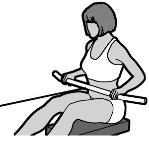 I designed the graphics in Photoshop. Models were rendered in DAZ Studio with a custom Photoshop script to get thick character outlines and to get the hand drawn style I wanted. Most training apps have photos/videos of real people, which looks very cluttered on a small screen. I went the opposite way and refined my characters until they had as low detail as possible, to illustrate the exercises really clearly.
Interface components
The screen real estate on a phone is very small and precious. You can't show many things at the same time, or it will look cluttered. And for athletes it is important that texts, icons and buttons are large, because no one has the patience to look at small details when they are sweating away during a workout.
This premise is very hard to design for, especially for an app like mine that has a ton of functions. The GUI was very time consuming to develop for the app.
To make a GUI work, it must show context so the user knows where he is, and it must be obvious to him what choices he can make at every moment. I use a few different metaphors to try to accomplish this:
- Free flowing components: All interfaces are pages with free flowing components instead of the more traditional form based style with fixed positions. I wanted each interface to feel more like a document than a form.
- Tabbed main interface: There are four main pages that you can switch between (start page, goals, library and diary). By the use of the top menu they act like four tabs.
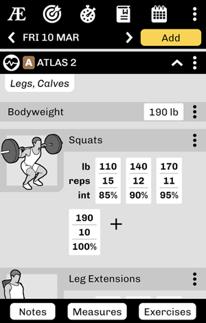
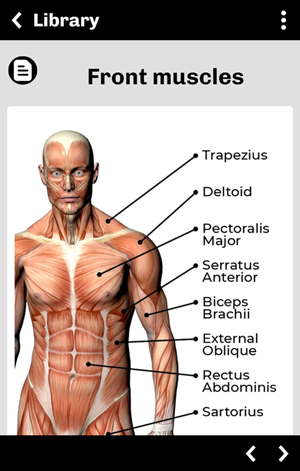
- Expandable sections: The pages use collapsible/expandable sections to initially hide away content. This is used for example to show a folder hierarchy in the library, and also when the diary lists the activities for a day.
- Sticky section headers: Expanded sections can have tall content, so when you are in the middle of scrolling through a section, the section title is kept sticky at the top of the page to tell you where you are.
- Sticky section footers: These work similar to sticky headers, and contain the most important tools for the current section. For example, as you scroll through a workout, the button to add more exercises is in the sticky footer at the bottom.
- Lots of menus: Each page has a menu, and many of the elements on a page have their own menus. This is a good way to hide away functions to clear up the screen.
- Browser navigation: You navigate between pages in the library the same way you navigate a web site; when you push a link or icon it opens a new page, and you can return to the previous page by pressing the back button.
Data entry
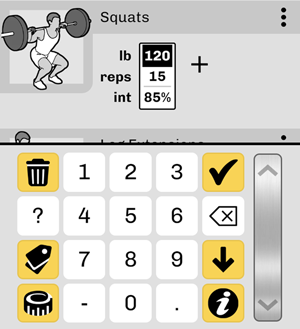 I spent a lot of time thinking about data entry, because that is what you spend most of your time doing when you use the app. I want data entry to be quick and easy, to give a great user experience:
- The app always suggests values for every type of entry you can make, so you don't have to fill in a value from scratch, but instead just adjust it up or down.
- To overcome the limitations of the built-in keyboards on mobile devices, I added a custom keyboard with larger buttons and custom functions, for example switching between units of measure.
- The custom keyboard has a universal slider that you can tap or swipe to increase or decrease values quickly. You rarely have to type in a value, instead you just adjust the suggested value using the slider.
Main pages
 The app has four main pages:
- The start page: this is the first page that opens when you start the app. It shows your current and planned activities, so you quickly can get an overview of your day.
- Goals: lists the goals you have set for yourself, and keeps track of how close you are to reaching them.
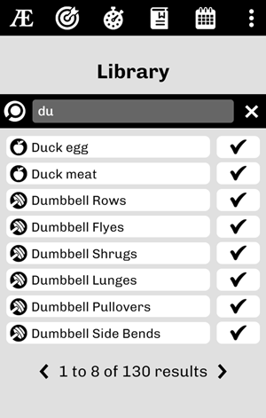
- Library: a folder structure of pages. Each database item is shown as a page in the library. This includes workouts, training programs, exercises, meal recipes, ingredients, etc. This is a major difference compared to other apps, and makes Athletium feel more like a platform than just an app. The library is a database of content that the user can expand by adding his own content or content from other users.
- Diary: shows a calendar overview of past and future activities, and lets you plan each day with workouts and meals. The items in the library are used as templates that are copied and inserted into the diary. For example, when you plan a specific workout for tomorrow in the diary, you pick that workout from the library, and a copy is made and placed in the diary.
Programs
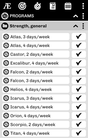 A program is a sequence of workouts that you do the same way week after week, for example an upper body workout on Mondays, and a lower body workout on Thursdays.
Programs are found in the library. To make programs flexible to create and use, I decided to show a program page exactly like the diary is shown. I think this makes it easy get a good overview. Instead of a full month of days, you define just one week (or a few weeks), and when the program is inserted into the diary, it is repeated for as many months as you want.
You can also have the app fill in sets for all the exercises, and have the weights increase over time, to get a program with progressive overload.
Sharing
Sharing was a very hard tech problem to solve, but also very important to get right. Great sharing functions not only gives a great user experience, now that everyone is on social media, but it also gives free advertisement for the app.
The huge advantage of a PWA over a native app is that when someone clicks on a link to the PWA, it is immediately up and running in their browser. For a native app you must go to an app store, look up the app, press some buttons to install it, consent to app privileges about your contacts, etc.
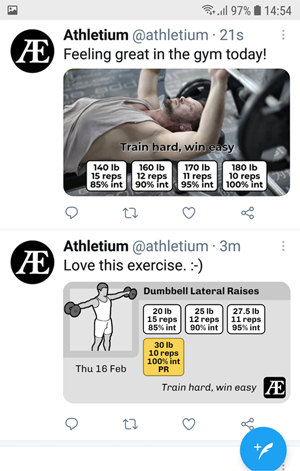
When someone has created their own workout in Athletium, and shares it as a link on social media, then every person who clicks that link will immediately get the app on their phone, and it shows the workout inside the app itself. No installation needed, it just works right away. Now another person has the app on their phone and hopefully starts using it. I hope this advantage leads to a snowball effect over time.
 Examples of things you can share:
- Any page you have created in the library (a custom workout, meal recipe, program, exercise, etc).
- A photo of yourself doing an exercise with the weights and reps as overlays in the picture.
- A photo of a meal you just ate, with the ingredients and cooking instructions as overlays in the picture
- Your entire diary, so your friends can follow your future progress.
- All your results for all exercises, as text or a spread sheet.
- Badges that you earned by reaching goals.
Strength algorithms
Planning workouts ahead of time is a central function of the app, and that includes planning sets with weights and reps. To do this, the app has complex algorithms to know the user's strength at various exercises. Initially this is based on the strength entered in the user profile, and later it is based on real values logged in the diary.
To make accurate strength estimations, I decided to use the traditional Epley formula, but adjust it for effective weight, intensity and muscle fiber composition.
I came up with the idea of effective weight to compensate for exercises that also lift parts of your body. For example, doing Chinups with 20 kg is much harder than doing pulldowns with 20 kg, even though the movement is exactly the same and affects the same muscles. Obviously this is because you also lift your body in Chinups. So I assigned a bodyweight influence value to each exercise, which is a percent value of how much of your body you are also lifting. For Chinups this is 95%, because you lift your entire body except your forearms. For Pulldowns this is -5% because the weight of your arms help pull down the bar for you. To calculate effective weight you take the weight of the barbell plus the weight of the exercise specific percent of your body.
Intensity is how many percent of your max weight you are using for the exercise, based on effective weight. So if you can at max do 10 reps with 100 kg effective weight for Pulldowns, but you instead do 10 reps with 80 kg, your intensity is 80%.
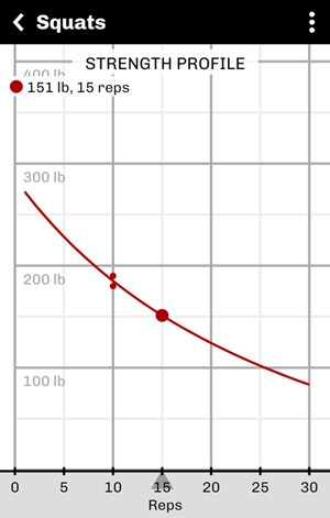 To get an estimate of muscle fiber composition, I compare how strong the user is at low reps vs high reps for the exercise. If it follows the standard Epley formula, then I assume that the muscle fibers on average are 50% fast twitch and 50% slow twitch. To make this calculation, the app collects all the recently logged values in the diary for the exercise, then adjusts the Epley formula to match the values as close as possible, by the use of a curve fitting algorithm. This results in a curve factor that is also used as an indicator of percent fast twitch fibers.
The user can see the resulting curve at each exercise's strength profile diagram.
License model
I decided to license the app on an account basis instead of an installation basis. An account includes a personal profile and a diary. Then you can install the app on as many devices as you want and share the account between them. This works well if you prefer to use your phone in the gym and your computer at home.
You get a free trial for 30 days, then it is a one time cost of $10 USD for a perpetual license. Many apps have a subscription model, which I strongly dislike. Pay once, use forever is much more attractive. It is difficult to set a price on something like this. Personally I think the app is better than many apps that cost up to ten times as much. But I am hoping for a more wide spread use, so I am setting the price relatively low.